
Font
In an earlier module, we briefly mentioned these type and text properties. We will take a closer look now.
|
FONT
font Sets all the font properties in one declaration (short hand) font-family Specifies the font family for text font-size Specifies the font size of text font-style Specifies the font style for text font-variant Specifies whether or not a text should be displayed in a small-caps font font-weight Specifies the weight of a font |
TEXT
color Sets the color of text direction Specifies the text direction/writing direction letter-spacing Increases or decreases the space between characters in a text line-height Sets the line height text-align Specifies the horizontal alignment of text text-decoration Specifies the decoration added to text text-indent Specifies the indentation of the first line in a text-block text-shadow Specifies the shadow effect added to text text-transform Controls the capitalization of text unicode-bidi Used together with the direction property to set or return whether the text should be overridden to support multiple languages in the same document vertical-align Sets the vertical alignment of an element white-space Specifies how white-space inside an element is handled word-spacing Increases or decreases the space between words in a text |
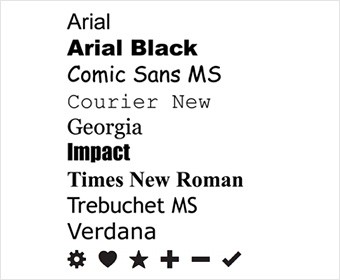
Font Family. Here is a list of default font faces that Mac and PC support by default.
Font size
Type scales
You may have noticed that programs such as Word, Photoshop and InDesign offer the same size of text. This is because they are set according to a scale or ratio that was developed by European typographers in the 16th century.
pt px percentage ems
pt is often used by print designers. A pixel roughly equates to a point because a point corresponds to 1/72 of an inch, and most computer displays have a resolution of 72dots per inch. (72dpi)
12 pixel scale
h1 24px 200% 1.5em
h2 18px 150% 1.3em
h3 14px 117% 0.875em
body 12px 75% 1em
p 0.75em
16 pixel scale
h1 32px 200% 2em
h2 24px 150% 1.5em
h3 18px 112.5% 1.125em
body 16px 100% 1em
p 1em
“Ems” (em): The “em” is a scalable unit that is used in web document media. An em is equal to the current font-size, for instance, if the font-size of the document is 12pt, 1em is equal to 12pt. Ems are scalable in nature, so 2em would equal 24pt, .5em would equal 6pt, etc. Ems are becoming increasingly popular in web documents due to scalability and their mobile-device-friendly nature.
<!--This is my favorite method for declaring font size. It is scalable!! Here is an article regarding using em: https://css-tricks.com/why-ems/ -->
While em is relative to the font-size of its direct or nearest parent, rem is only relative to the html (root) font-size.
Pixels (px): Pixels are fixed-size units that are used in screen media (i.e. to be read on the computer screen). One pixel is equal to one dot on the computer screen (the smallest division of your screen’s resolution). Many web designers use pixel units in web documents in order to produce a pixel-perfect representation of their site as it is rendered in the browser. One problem with the pixel unit is that it does not scale upward for visually-impaired readers or downward to fit mobile devices.
Points (pt): Points are traditionally used in print media (anything that is to be printed on paper, etc.). One point is equal to 1/72 of an inch. Points are much like pixels, in that they are fixed-size units and cannot scale in size.
Percent (%): The percent unit is much like the “em” unit, save for a few fundamental differences. First and foremost, the current font-size is equal to 100% (i.e. 12pt = 100%). While using the percent unit, your text remains fully scalable for mobile devices and for accessibility.
Keywords – Example: small, large, x-small, x-large.
The key is to stay consistent and plan for your font sizing when you design your initial site mock-ups. The thing to pay attention to is overall site scale and proportion of elements. A page is ideally designed when all elements work together for maximum harmony, hierarchy, and visual flow.
To declare font size you can use:
font-size:14px;
font-size:2em;
Font-style
you can define your font style like this:
font-style:italic;
